Having all of the data center and network documentation in place in a system is not always the end game: we also gain insight from the data, gain a better understanding of how the data’s aggregated and, perhaps, take action.
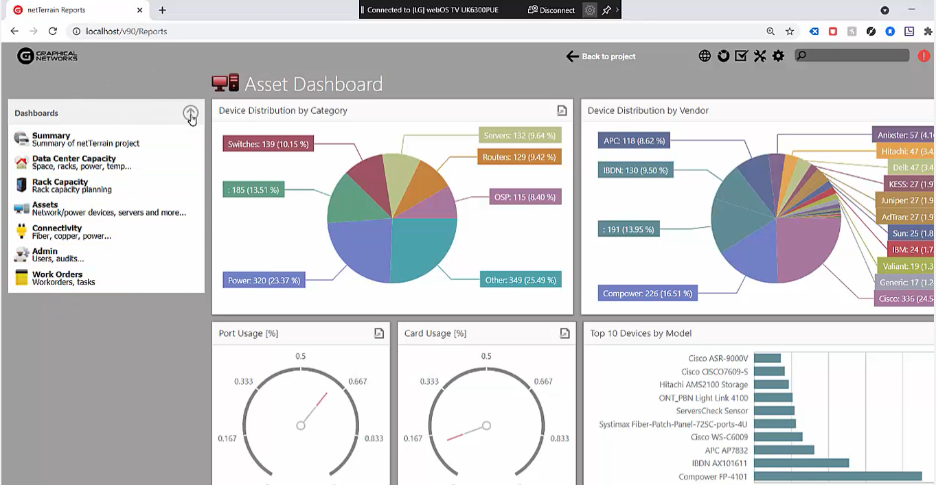
Usually these insights come in the form of reports (which may look like, as shown in the image below, a collection of widgets that are accessible from one or multiple dashboards). In this blog, and corresponding video, we’ll explore how easy it is to create custom dashboards in netTerrain.
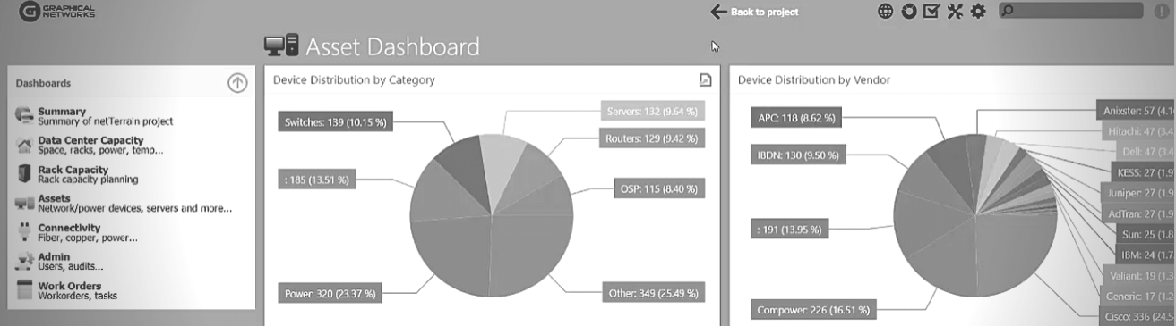
 An asset dashboard in netTerrain
Reports can come in the form of table views (tables that consist of rows and columns, such as the one below).
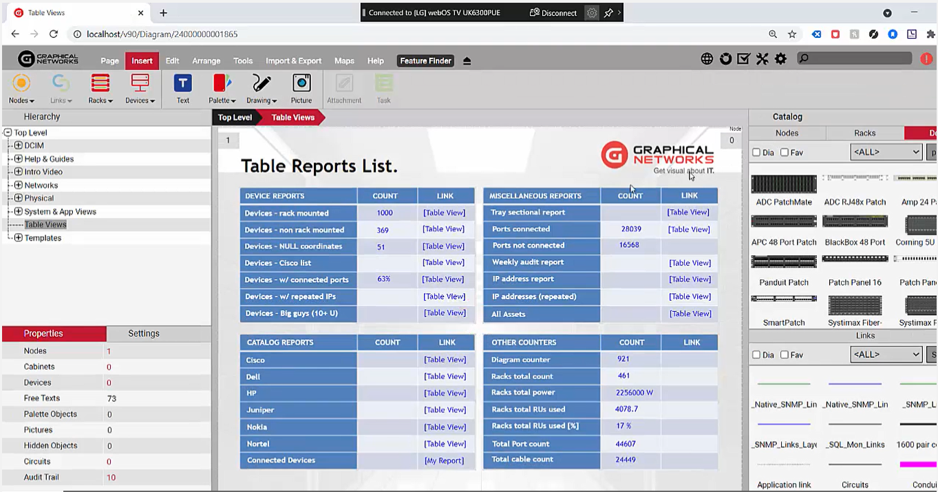 A table view
Table views can be easily accessed by double-clicking on a node or on a property or on a displayed field. In netTerrain, there are many ways to aggregate data and to gain insights from your data center and network documentation.
Graphical Networks provides many of these reports as canned reports that are already included in the software (we provide about 100 table views, about 200 expressions or ‘aggregate functions’ as we call them); we also provide about six or seven dashboards that each can have multiple widgets.
The reality, though, is this: customers always want a new or different report and this is why we will create reports for you as part of our maintenance at no additional charge. We also equip you with the tools to create these reports manually so you can create them easily without having to create a ticket for us to create.
Let’s dive in: we’ll begin with the table views.
Table views are fairly straightforward: usually a table view is created simply by inserting a SQL file on the netTerrain server under a specific folder called “SQL tables”. Below, you can see that we have a number of them that are already pre-defined:
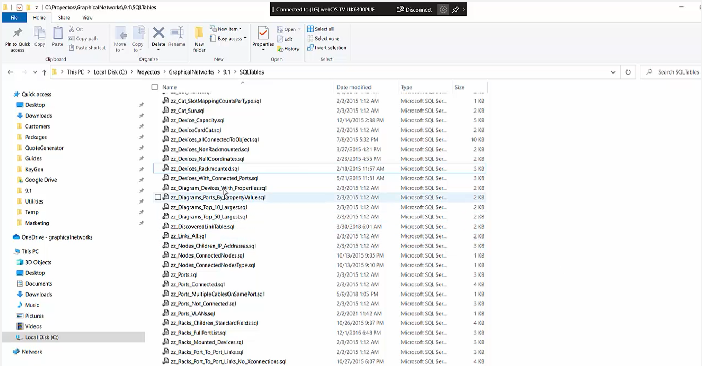 Pre-defined SQL files
In the example above, which is a report or table view of all the rack-mounted devices with some properties, you can see that it really just consists of a SQL query. Usually our customers just open a ticket and then we build this report for them at no extra charge under maintenance, however: if you feel the urge to write it or enjoy poking around our fully-documented database (it’s documented in a PDF guide which provides the full database description), you can go ahead and begin writing reports and SQL management studio or, rather, write queries and test them and see if the results provide the data that you need, and then, boom: you just dump them as a SQL file in this SQL table. It’s very straightforward — but it’s also not that fancy (as it’s just a table view):
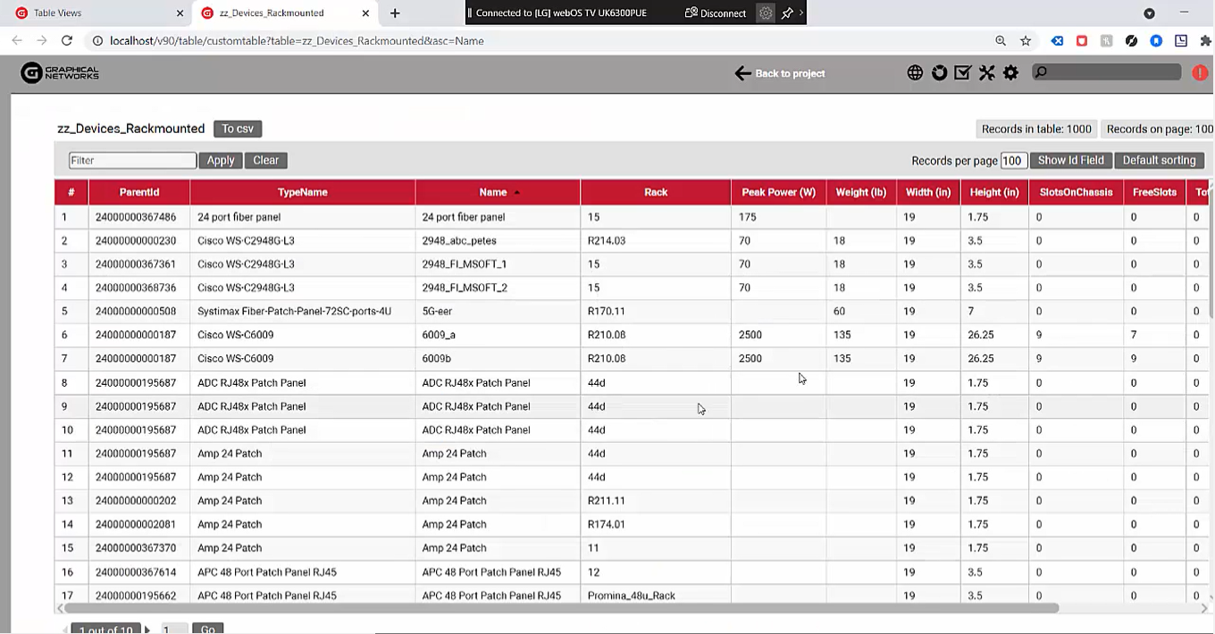 Basic table view: no bells and whistles
Let’s check out our second type of reporting engine: we call it reports or dashboards. This is fancier because it provides the data in a graphical format aka a business intelligence engine or business intelligence (BI) tool.
Again, we provide the means to create these reports yourself and you can customize them completely.
Let’s check out some of the elements that are included in our dashboard, aka BI, reporting engine.
First, the dashboards are on the left. The arrow (you can see it in the video or in the image below) means you can create multiple dashboards, and multiple sections, so you can have multiple dashboard sections with an arrow each to expand and collapse and each one with their corresponding dashboards. When you click on one of these dashboards, you can access the widgets that comprise it.
 The arrow on the left gives you access to multiple dashboards
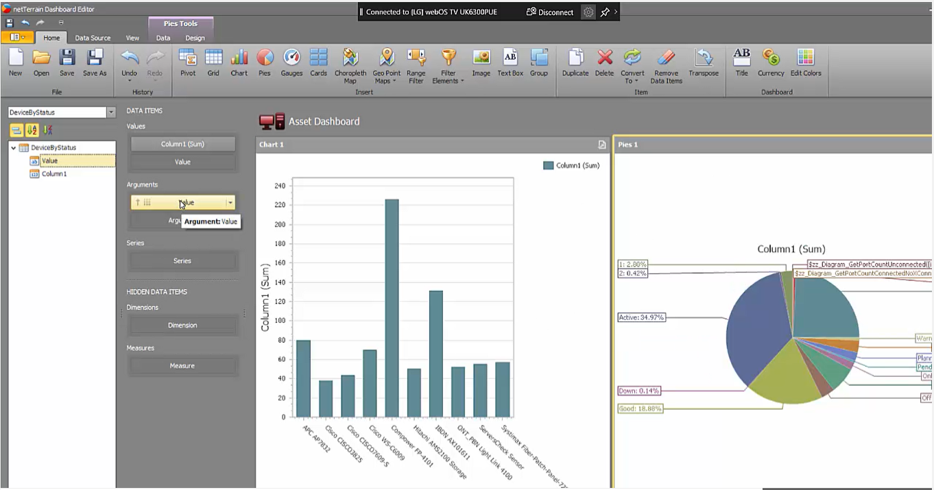
In this example, it’s a rack asset report or a data center capacity report: each one of these contains multiple widgets. These widgets can be bar charts, pie charts, time series, speedometers, and maps — but also tables, pivot tables, and even just simple labels that aggregate a scale or function…and more!
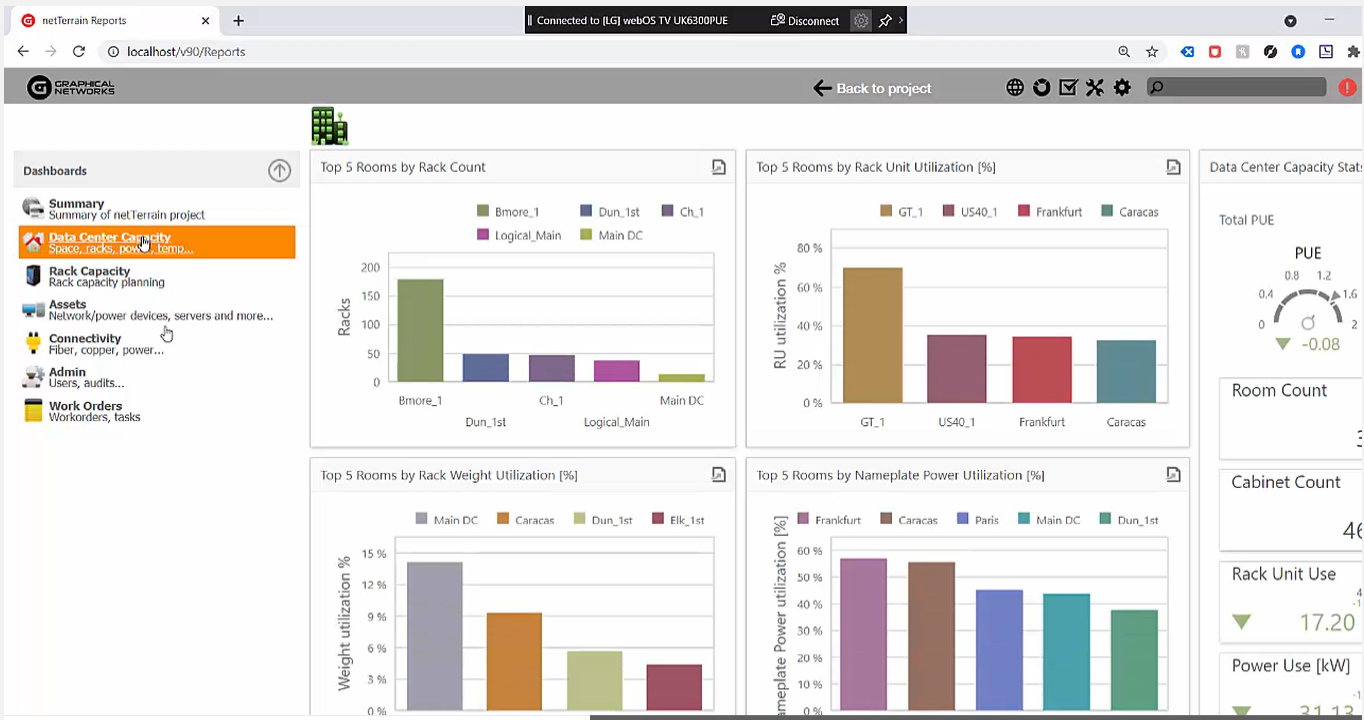 From bar charts to speedometers, widgets can be anything
How do you create or customize these dashboards? Within the netTerrain server, we’ve given you a tool called the netTerrain dashboard editor.
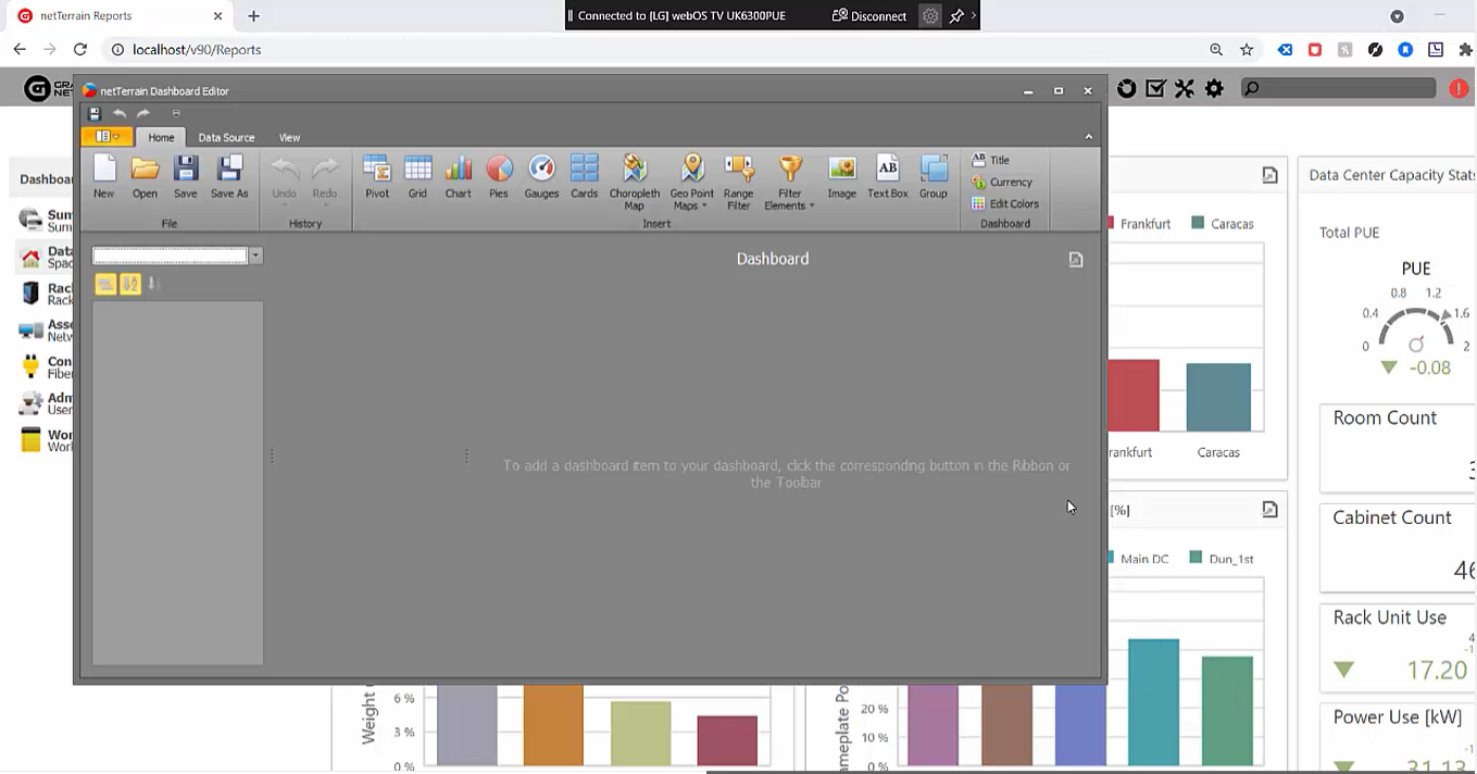 Create or customize dashboards with netTerrain’s dashboard editor
You’ll usually just open an existing dashboard and then modify it…that’s probably the easiest way. If you’re so inclined, however, you can create a dashboard from scratch.
The first step to create a dashboard from scratch is to create a new data source. For the sake of example, we’ll create a couple reports. One of them will be “Top10DeviceUsage”.
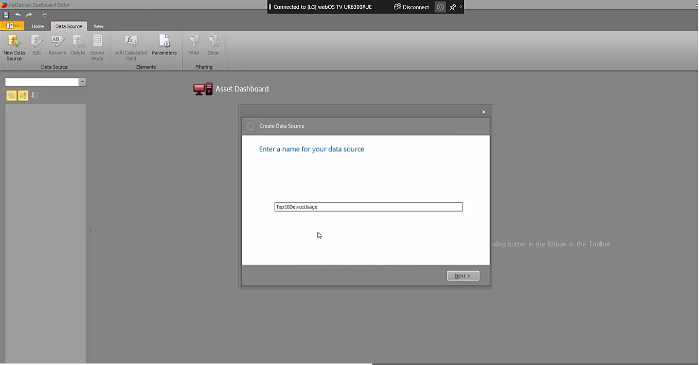 Create and name a new dashboard in just a few clicks
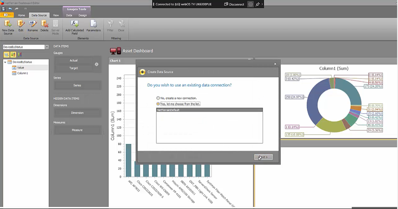
First, you create a data source— if you bring the data from netTerrain, you connect to the netTerrain default string (you can use this BI tool to connect to virtually any database in your organization since netTerrain gives you an array of different backend engines that you can connect to).
 Bring in data from netTerrain or connect to any database in your organization
The tool has a visual drag-and-drop graphical user interface (GUI) that lets you create queries. You can extract the data directly from a table so it’s a raw data extraction (or you can use the GUI to create your query using joints, etc. on the fly). Alternatively, do you already have the SQL expression? Just paste it and preview the results. In this case, we have the top 10 device types by usage:
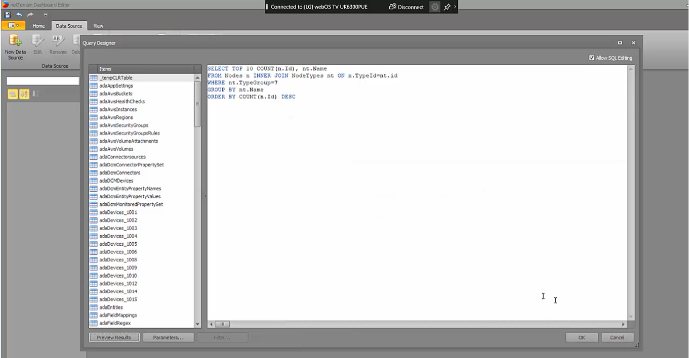 If you already have the SQL expression, just copy and paste it
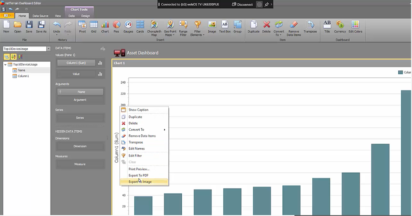
Again, you can just request these queries from us. So, here we have the data source; the second step is that I’ll choose some sort of widget to apply to the dashboard. Since this is the top 10 device usage report, we’ll do a chart.
Next, drop the corresponding columns to the values and arguments data items in the dashboard: this is just a drag-and-drop operation. I’m not going to go through the whole process today, but you can customize a number of things: sorting, invert the sorting, change the colors, change the names of the X and the Y axis, transpose data, add filters, and so on.
 netTerrain’s dashboard designer offers lots of customization options
There is a lot you can do with these widgets and the bar chart is just one example. Head over to “Design” and you can change the chart’s appearance: to a line, trend line, financial, ranges, and more. There are a lot of different features that you can apply.
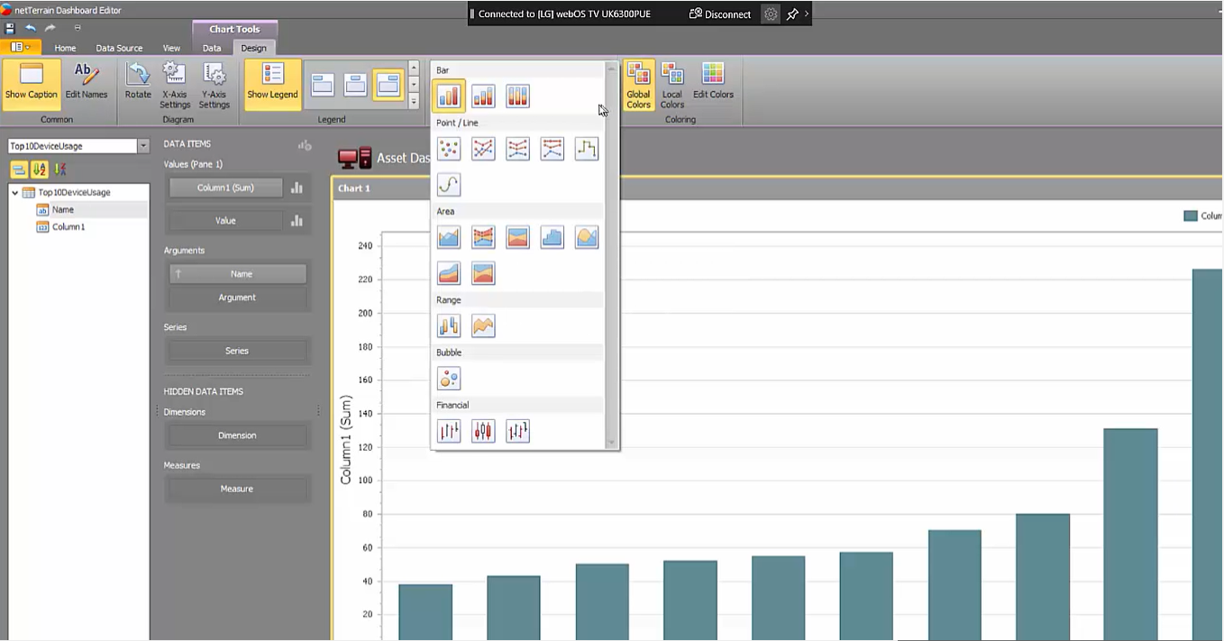 Change a chart’s appearance with the click of a button
So, now I’ll create another data source: for this example, a pie that shows me the devices by a status value. I’ll go ahead and create a data source, use the default connection string, and insert the SQL expression, preview the data, and again, we have some information here about different devices by status (it doesn’t really matter what the data is as this is just an example).
Next, I’ll insert a pie. Again, same thing: I’ll put in the values and arguments. Just like that, we now have a pie chart for which we can also change the design in different ways, colors, change the data labels that I’m showing, the tooltips that I’m showing, etc.
 Adding and visualizing multiple data sources is simple
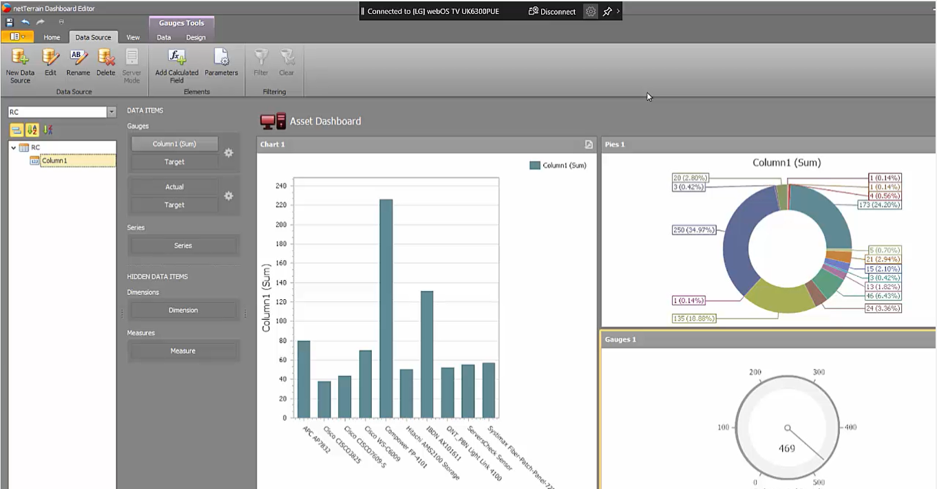
As you start adding these widgets, you can also rearrange the positioning — vertical, horizontal, basically how the real estate is laid out. There are gauges and all sorts of other elements. So, let’s say we want a rack count: we can use another data source for this. Easy to accomplish.
 Bring in data from netTerrain, such as a rack count, in seconds
This is, in a nutshell, how you organize your dashboards and your widgets using netTerrain’s dashboard designer. Just to repeat this once more: you can have our team create dashboards and reports for you (it’s supported in your maintenance contract automatically as you become a customer so you don’t have to create these on your own if you don’t want to). At no extra charge, you just request them from GN, specify which widgets you want to use and how you want them to look, and that’s it.
 Our example dashboard: created in just a couple minutes
In sum, netTerrain’s dashboard designer is a very easy tool to use — especially if you have someone in the organization that knows a thing or two about reporting, and BI, and SQL that a lot of our customers do it themselves. You have a lot of flexibility — and, again, you don’t necessarily have to report on the netTerrain data! You can bring in data from other systems and pretty much use netTerrain as a business intelligence umbrella to your entire IT organization. If you’re not a netTerrain user and you’re looking into DCIM or network documentation solution, be sure to find out what reporting and dashboard options a potential software solution can offer.