 Many of my recent articles explore netTerrain’s various use cases — with respect to network documentation, data center infrastructure management (DCIM), and managing fiber plant (outside plant). In this article, I am going to take a step back to talk about how you can optimize your business with the power of data visualization.
Typically, IT information is maintained in unconnected and disparate files and other data sources that are scattered around the enterprise, for example: spreadsheets, Visio diagrams, databases, service desk, and network management systems (or maybe all network knowledge comes from Bob, who has been with the company for over two decades). Click here to read more about how this leads to headaches — and what you can do about it.
Obviously having important network information all over the place is not efficient, but how does this impact meeting business objectives? Are database forms and reports good enough for connecting IT to business? Visual network diagrams and data to support business decisions have a far greater impact (I’m not saying that reports aren’t also important — netTerrain has a full reporting capability from dashboard and table reports — click here for more on reporting and dashboards in netTerrain).
Challenges Facing IT Today
Why is having up-to-date and visualized network information important? Network diagram software and documentation helps solve challenges facing IT today, such as:
- A need to tie IT and business for better business decisions
- In most cases it is the changes, made by people in the environment, that causes the most problems
- Finding these problems is time consuming and expensive
- More and more people depend on this information
- Lack of reality in existing IT documentation: typically, out-of-date
- No easy way to manage information’ and ‘knowledge
- No easy way to see redundant resources and impact
- Manual documentation is expensive and time-consuming
Automated, data-driven diagrams helps you to solve these challenges.
IT Complexity Hurts Business Performance
During our discussions with folks considering data visualization software over the years,we’ve found that many organizations have multiple and different data sources — and these different data sources do not seem to talk to each other.
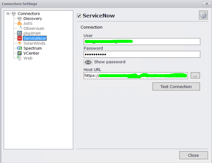
With the advent of Web APIs, especially REST APIs, connecting to other data sources is now a much easier task. The configuration management databases (CMDB) out there, such as ServiceNow, helps to bridge the disconnect ( as well as Business Intelligence applications). Data visualization software such as netTerrain can be viewed as a visual CMDB, as you can bring in different data sources into netTerrain and tie the data to visual diagrams….a picture is worth a thousand words, right? For more information about netTerrain’s discovery and connectors, click here.
 Visualize and integrate disparate data sources with data visualization software
By using software such as netTerrain, you have a visual understanding of your entire infrastructure — not just the network! You can easily search and find exactly every device or any other asset in your infrastructure in seconds. Not only can you find what you need quickly, but you can also see what is connected to what, and how important it is to your business. This leads to a dramatic improvement in mean-time-to-repair (MTTR).
Data Visualization Improves Outcomes
Organizations can also save money by knowing exactly what is in your infrastructure and reducing the duplication of purchases and improving capacity planning of your business. Data visualization offers detailed graphical depictions that allow for informed decision making — from the micro to the macro level.
With data visualization, you can:
- See IT asset and inventory data graphically
- Consolidate stakeholder knowledge in a single repository
- Troubleshoot network problems with data-driven physical and logical views of your entire networking infrastructure
- Easily incorporate legacy data, files, spreadsheets and all the supporting documentation you need
- Graphically generate complete circuit paths on the fly, including all related ports, cards, and equipment
- Organize infrastructure information in easy-to-understand graphics to increase enterprise-wide accessibility to mission-critical data
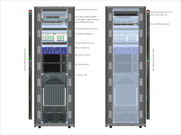
- Get automatic graphical depiction of IT components, rack elevations, network topology maps, and its connections
 Detailed graphical depictions allow for informed decision making from the micro to the macro level
Data visualization software has the power to help organizations better meet business goals, but it also has the capability of becoming shelfware. Not all data visualization software is the same…and it’s never a one-size-fits-all solution. If you are considering adding data visualization, look for software that is, first and foremost, usable. Tools should help you do the job, not be the job and ultimately save your organization time and money! If you’d like to test drive netTerrain for your data visualization needs, click here to get a demo.