
netTerrain Dashboards (also called reports) are collections of gadgets showing aggregated data from the netTerrain database. These dashboards are accessed from the netTerrain project with a simple click (as we will see below). Whether it’s for DCIM, network mapping and documentation, or outside plant dashboards offer a very powerful visual way of aggregating and displaying data to aid in the decision making process.
Dashboard Gadgets and Typical Uses
Actionable data is presented via interactive gadgets in a number of different arrangements, such as:
- Charts
- Pies
- Gauges
- Cards (or labels)
- Other gadgets (maps, pivots, grids, etc.)
Charts are typically used to view and compare data in series typically represented in an x and y coordinate axis, such as the example below, showing a Data Center Capacity Planning series of charts.
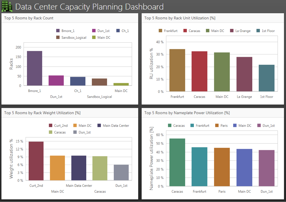 An example of a chart
Pies are typically used for at-a-glance views of percentages or similar comparative purposes, such as the example below showing network (or data center) device distributions by category (servers, routers, switches, etc):
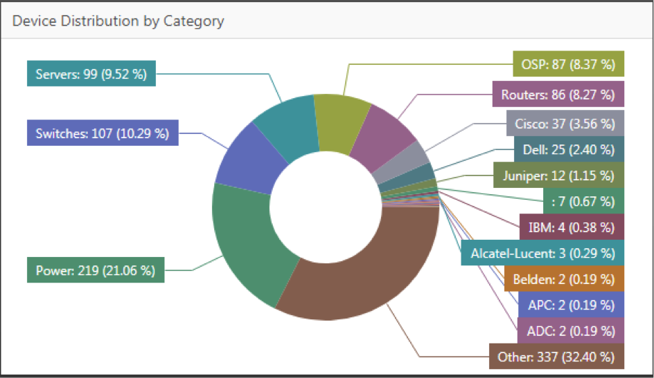 An example of a pie chart
Gauges typically deal with more atomic type values. For instance, it is very common in a DCIM deployment to require a reading of your Data Center PUE, including your current value and goal. A gage is perfect for that. Cards (or labels) are great for showing in big, bold numbers, specific scalar values that are important for you. For instance how many network devices are currently alarmed or what your current Data Center power usage, temperature, and rack unit utilization is.
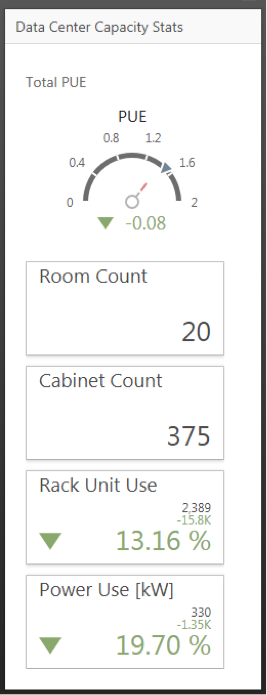
A gage and labels
Other interesting gadgets you can use with netTerrain dashboards include simple grids (similar to the netTerrain table views), Pivot tables, maps — which come in two fancy sounding versions (choropleth and Geo point), and more.
Customization Capabilities
Many Data Center Infrastructure Management (DCIM) software packages, DCIM tools and Network Documentation or Network Mapping software tools out there already include dashboards. What makes netTerrain’s unique is that we also ship with a dashboard designer. This designer lets you create your own dashboards. It’s actually easy to use and fun! So much so that if you are a customer under maintenance and want your own custom dashboards but don’t have the time to build them, you can simply request them from us at no charge. We will build your custom dashboards for you. Customized dashboards may include data from other data sources as well, including most commercial database engines.
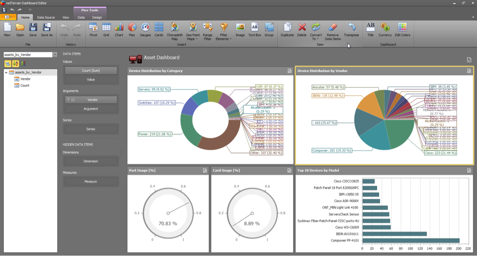 netTerrain dashboard designer
It’s beyond the scope of this specific guide to learn how to create your own dashboards, but it’s worth mentioning some of the capabilities that exist in the tool.
All the gadgets mentioned above can be customized to the last T. For example, you can take a chart and change the axis orientation, the charts titles and legends, the color schema, the captions, and even the series type. This last piece is really feature rich! You can choose a series type that uses bars, points and lines, areas, ranges or bubbles.
Pie charts are quite fancy as well. You can edit the data labels, tooltips, captions, styles, color schemas and much more.
To many of these elements you can add filters, hidden dimensions, aggregate functions and more. One particular feature that is interesting is the ability to drill down into a chart. For instance, you may have a pie chart showing categories of devices in your data center and then click on a specific slice (say, server ) which drills down into a new pie showing all the servers by vendor.
Moreover, you can take this further and combine dashboards charts with netTerrain table views, such as in our example here, you click on a specific server vendor slice say, IBM ) and it opens a table view with all the instances of that server model in your project, including a link to go to the diagram of that specific router.
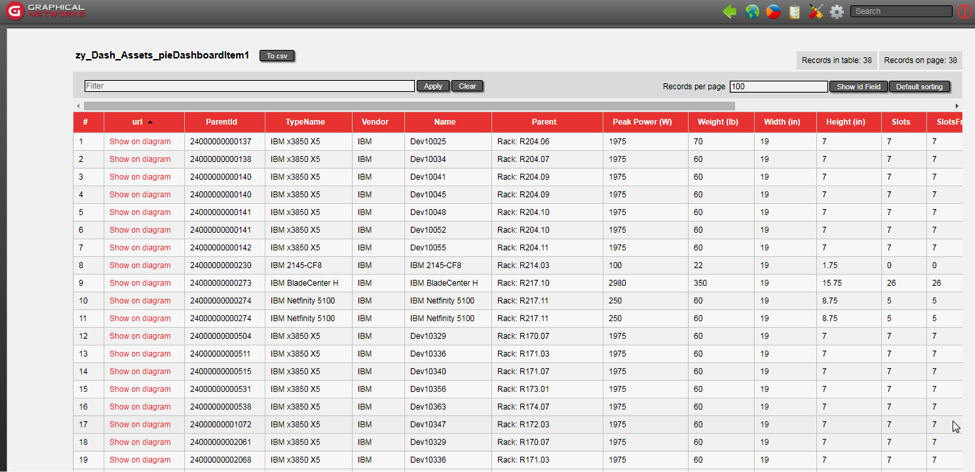 Drilling down from a pie chart to a able view in netTerrain
In our next blog, we will chat a bit about some of the default dashboards already included in the system and how you can take advantage of them in your DCIM, Network Documentation and Outside Plant projects.