In 2019, it’s all too easy to start talking about network documentation, mapping, and diagramming as though it’s a new innovation that’s evolved specifically for getting, and acting upon, information about IT networks and infrastructures. Though automated network documentation, such as netTerrain Logical, is something that has evolved in the current age of information we all live in, documenting networks of information has been around for a long time.
How old is network documentation, you ask?
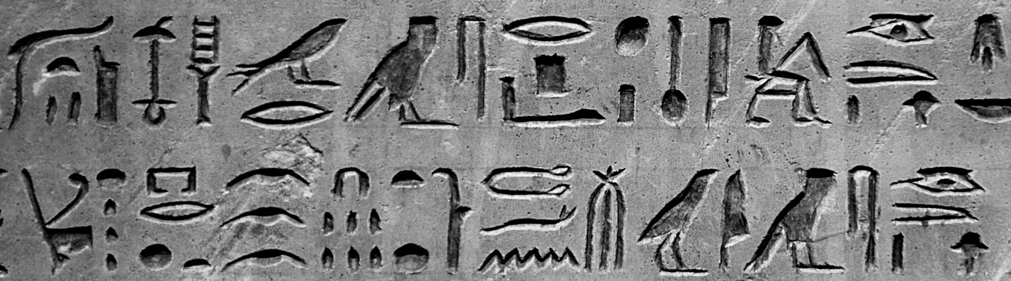
For as long as we have walked the earth, from Ancient Egypt to the Native Americans, we have sought out pictorial symbols for the exchange of information (cue some pleasant documentary movie music softly playing in the background)…
Methods of documentation do not have to be incredibly high-tech. Ever used a rubber band to remember an important task? Put an X on the calendar to remember an anniversary? What about post-it notes? If you have, you’ve used visual symbols to represent information…or, in other words, you’ve used low-tech methods of network documentation
Back to my exciting history lesson for a moment. Believe it or not, people used network documentation back in the 1800’s…bet you didn’t know that one, did you?
Charles Joseph Minard, for example, was a French civil engineer active in the 1800’s. He was known for visually depicting numerical data on geographical maps and is particularly known for his flow maps (or so Wikipedia informs me). Minard’s ‘flow maps’ were considered revolutionary at the time. They used data to visualize traffic on existing roads to inform stakeholders such as engineers as they made decisions about routing rail lines.
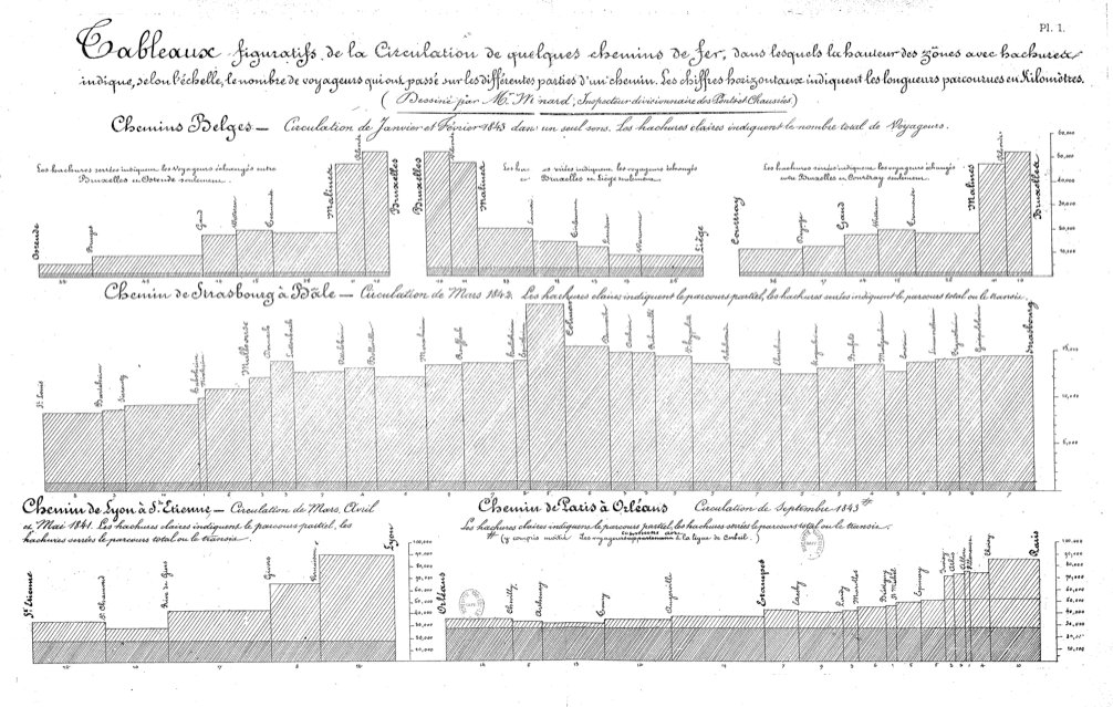 Example of Charles Joseph Minard’s Flow Maps for Rail Design
Flow maps for railroad design are all well and good, but Minard really left his mark when he created a flow map, based on data, to illustrate the size of Napoleon’s army at different locations as they advanced and retreated: the map included the temperatures, distances traveled, latitudes and longitudes, and the direction in which Napoleon’s troops were traveling.
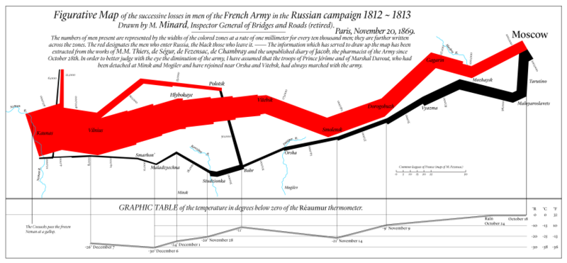 Example of Charles Joseph Minard’s Flow Map of Napoleon’s Army
In the above map, you can see how Napoleon is getting his arse kicked by the Russians (who would ever go into Russia in the winter…does no one learn). It’s a visual masterpiece. Here, the data is turned into a graphic and boom an explanation of a whole war campaign in one heck of a compelling diagram.
Well, ok, so it was not a computer network…but it was an Army. Does this really qualify? Well… in my blog it does!
The point I’m trying to make about network diagrams and documentation is this: why should network documentation be visually-based?
Afterall, why not just use a spreadsheet, CSV file or a database? Because: we are visual creatures and like to look at stuff when we can (think: binge-watching favorite shows on Netflix).

From ancient hieroglyphics and cave drawings, to today’s automated network diagramming solutions, one thing is true: for as long as we humans have been around, we have relied upon visual symbols to categorize, remember, and most importantly, to act on information.
So…back to why not just a spreadsheet to document the network?
 Example of a Layer 3 Logical Network Map/Diagram
A spreadsheet is a blur of numbers, rows, and columns. Trying to manage the terrain of a living, breathing, changing network in today’s tech-driven economy is like trying to write a complex novel such as Paradise Lost…in hieroglyphics.
Bottomline? If you want to map, diagram, and document your network’s terrain, get yourself something automated and visual…such as, shameless plug here, our automated network documentation and diagram software netTerrain.